|
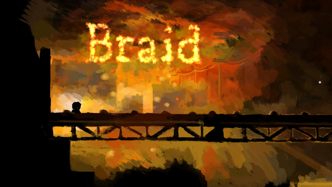
As one of the top designers for puzzle games, Jonathan Blow has paved the way for simple puzzle designs with a twist with not just one game, but two. Even though both of these games are different in terms of their main mechanic to explore the level, they both follow the same puzzle design philosophies and principles and excel well with teaching the player about the mechanics without a segmented tutorial. But first the game starts off with a showcase of the basic mechanics of the game, usually starting off with a straight walk to where you will find your first puzzle. Where Braid is platformer that starts you off in a Mario-esque fashion beginning where the player is started off to one side and is forced to move to the left and where the Witness starts you off facing the first door where you will eventually wonder toward. Both of these games, don’t tell you the controls for basic movement when you first open up the game and will only hint at it if you don’t move at all. This tells me that the game is meant to have a very basic control scheme with a focus on added mechanics in the form of gameplay and not added button presses. Throughout both games, you will have an interesting variation of the core puzzle mechanic. It’s the philosophy that the you can have high-level expressions with a base of low-level concepts. This mean that if you have a good solid foundation for puzzles, you will have the options to branch out in many directions which implies that you will have a complicated game with simple mechanics. You are able to tell from the creation of Braid, that not everybody enjoyed playing Mario again so the creator added an interesting twist, this being the time warp, to the mechanics and adding pieces as a collectable to a puzzle that you needed to collect in order to proceed through the levels. This may have turned a lot of players away from the initial design as puzzle platformers aren’t as popular as first person games. With this in mind, I reckon the creator of Braid made the game with that notion in mind and made a game for gamers with a focus more on 2D platformer enthusiasts. To create interesting puzzles in the game, the developer tries to emphasise the core mechanics (being the time rewind in Braid, and maze puzzles in The Witness). This is usually overlooked with many puzzle as some developers try to create cool looking puzzles by using/adding more mechanics without refining the core concepts of the original mechanic. In Braid, in “world” the time rewind mechanic is changed in a way that ties into its platforming genre e.g. in World 1 you press a button to move back time if you miss a jump (works as a safety net), the way it works in World 3 is when you move the character back and forth you are able to change the flow of time and gives you a different approach to the same puzzle. In the Witness, the completion of the maze is made a little harder by giving rules that you need to figure out for yourself. This does resemble the “add more mechanics” approach to its design, but these puzzles are instead directed toward world design by having these puzzles placed in interesting areas of interest.
This blog post is about what we learnt in the tutorial about materials. We spent most of this time editing tillable textures to make the normal, roughness and albedo. Here are some notes I took while in class.  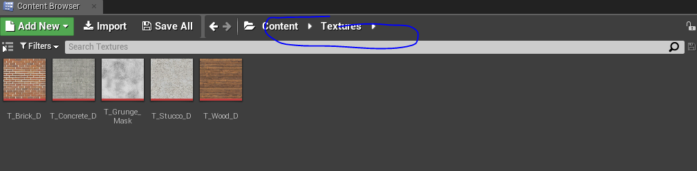 Then we started on the Photoshop techniques. Here are just a few of them Once we had set up all the maps that we needed for the test, we went straight into making materials in Unreal Engine 4. I had not really played around with the settings for materials in Unreal Engine 4 so this was a really good opportunity to learn all about this system. I actually learnt quiet about tillable textures in this exercise that will definitely help me in the future for texturing scenes. There are also a lot more options I wanted to test out e.g. Fresnel functions and grunge map that our lecturer had made in class. I also had help with the glass texture as Unreal Engine 4 has some limited settings when handling glass but there were some ways to work around that issue.
Great world design and level design is really specific to what type of game you’re playing and what type of genre it’s in. We can ask questions such as; Can the game lead you through the level without indicators, does the scene tell a story, does the character and the enemies fit into the game etc. These questions can be asked for any genre, but games that attempt the open world design usually have trouble filling the whole world with content. A game that comes to mind when it comes to great world design/great open world design is BotW (Breath of the Wild). What the game does successfully is that the game allows the player to make their own route (based on points of interest or just share curiosity) and is always filled with some sort of challenge. This type of design was improved by having really interesting ways to traverse from point to point with multiple routes to do so. Aesthetically, BotW has one of the most breath taking environments that has ever risen in gaming history that is supported with a great deal of level design. The first few moments of the game gives player a quick tutorial which gives the player, base knowledge of gameplay and set of rules that allows you to finish the game with. This is then followed up by a picturesque view of what you may think is the whole world but player soon learn that the game is way bigger than that. This camera angle is smartly composed and so beautiful that you often want to just jump right into the fray and see what’s going on. The player will soon learn that the game provides you with queues to show that the player needs to be and will need to proceed with caution. Even though this view is quiet pleasing to look at, you can instantly tell that the character cannot just jump as it would probably kill you and even if you did you wouldn’t be penalised that much as it would just take you to the beginning which was only a few moments back or to the quick-save point. With this knowledge in mind, the player then shifts down the ramp where they will find items that will help them interact with the environment, teaching the vast amounts of interactivity with the environment that the game has to offer. The motive for moving from point to point is rooted deeply in every aspect about the games design. From the Sheikah towers that can be seen from every highpoint or mountain, to the quests that tells the player to explore an unknown area, the game wants the player to explore the seamless and the organic nature of BotW’s open world. The Sheikah towers plays on of the most important parts in exploring the games topographical map as the game over world is broken up into sections (this seems to be in sections of difficulty). From mostly anywhere in the map, if the player is able to see the tower that has not yet been activate, the journey there will have well placed enemy camps that test the player’s skill (especially if the player likes to travel quickly by horse) or going around the problem by traversing cliffs and finding glowing orange shrines that complement the games naturally blue hue on the way. 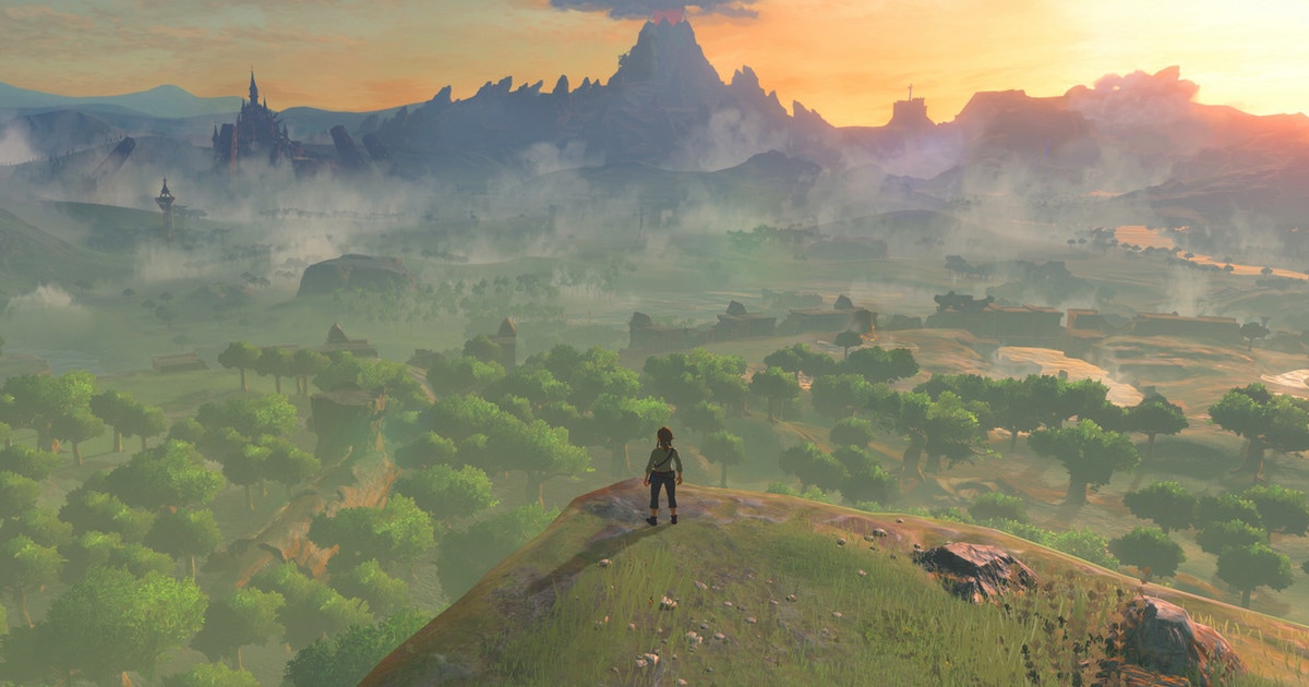 Abstract worlds
For this assignment we were assigned to play one of the two abstract games; Kairo (Pc demo) or Memory of a Broken Dimension and come up with some greater understanding of the world. Kairo is a game that really takes cubism to the interactive world successfully. If we look at this game through an abstract lens, the game doesn't really tick all the boxes in the sense of intangibility or the non physical. But how does this game help us in understanding the newer genre of games that have picked up the interest of media recently? A game cannot simply be called abstract, through adding random objects in a scene and left to the interpretations of the player to make out their own meaning, the objects have to have some sort of context and symbolism to have real meaning behind that in-tangible aesthetic. This game does have some design choices that resemble Cubism (abstract art) by breaking down the level design and almost going back to its grey box format. We can also tell that this was intentional as these blocks are also textured. I'm not sure what this really resembles in terms of the games narrative or purpose but this does make being able to understand the themes a little easier. If we just look at the games name, I would think that this game was based in Cairo, seeing that the names are very similar and this is where some of sarcophagi are being held. The reason being that I bring up the sarcophagi is that the first level has a tomb like structure with thrones. Usually I would associate such structures with that of Egypt and how they buried their "royal dead". As you proceed through the levels, you stumble across what resembles silhouettes of monolithic monuments. Not only do these structures resemble some monuments of Egypt, but they also have the same texture as sand stone. Even though these traits don't resemble the actual structure or themes directly, it leaves enough room that it could be interpreted a whole other way. Claude Monet created a series of pictures that he calls the Haystacks Series, where he created numerous drawings of haystacks. But not everyone agreed that they were haystacks and some couldn't see them at all. An opinion that really intrigued me was "That it was a haystack the catalogue informed me. I could not recognise it. This non-recognition was painful to me. I considered that the painter had no right to paint indistinctly. I dully felt that the object of the painting was missing". He goes on to state that the sensation of confusion and surprise was the purpose of the painting. It was the sense of realisation that the painter was going for. If we take this mentality to the game, I don't think the game has that same grip on me like the Haystacks series did on another person, but it did make me feel I was in another place completely. 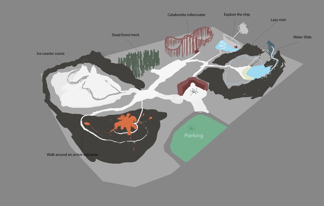 We were assigned to re imagine the Rainbows End theme park in New Zealand. The point of this exercise was to be able to lead your customers through the new theme park in a way that feels seamless and is enjoyable. This theme park is mainly based around enjoyable sites as well as small roller coasters and a water park. The park is laid out so that you attempt the sections clockwise starting from the Volcano, as the rock aesthetic of the water park blocks you off from that direction. This route leads you on a well paced where both the adventurist and the not so adventurist can enjoy their time.
Bioshock is renowned for its use of strong shapes in the art Deco aesthetic and even in the first scene/level you are able to tell. The use of negative space with the flames as well as the primary colour of the scene, reveals the gleaming silhouette of the plane parts that lead you to the lighthouse. This sets you up for the rest of the game as the use flashing neon lights in the gloomy dark setting of rapture. Grey is one of the main colours to represent the environmental pieces that are non interactable, but gives a great contrast for important landmarks. Different kinds of lights indicate specific types of items you will encounter, such as the blue lights will indicate that you are close to plasmid resources. First door puzzle uses your newly gained lighting power to activate the broken door panel that is clearly sparking. From this point on you are associating the blue light the the lightning plasmid ability. The props that the game uses for dispensing buyable items, comes in the form of a vending machines, which is very recognisable by the sound that they play and the lights that contrasts on the wall behind them. Flickering lights are also a great eye catcher for encounters, or an important cutscene. This technique was implemented very early in the game as the lights leading to the stairs on the lighthouse lead you to progression. Not only does this effect give a sense of dread within that area or scene but encourages you to break from original routes. 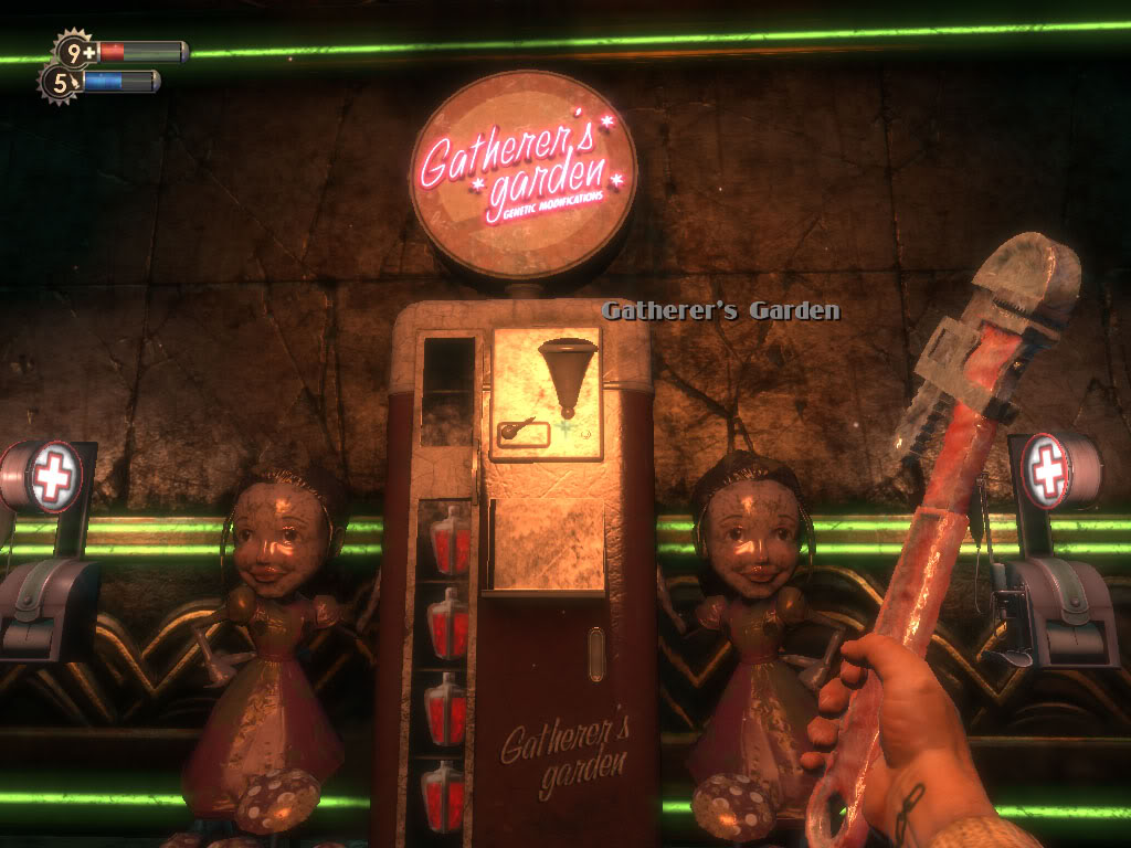 The use of light in this game is not only main use of navigation, the game utilises sharp shapes such as isosceles triangles and even statues of people pointing in certain directions. The natural shapes of the art Deco architecture give leading lines to the objective or passageway you may have to go to. With this sort of high detail art work, means that they have to be carefully place their props so they don’t make the area feel cluttered and unappealing to look at. 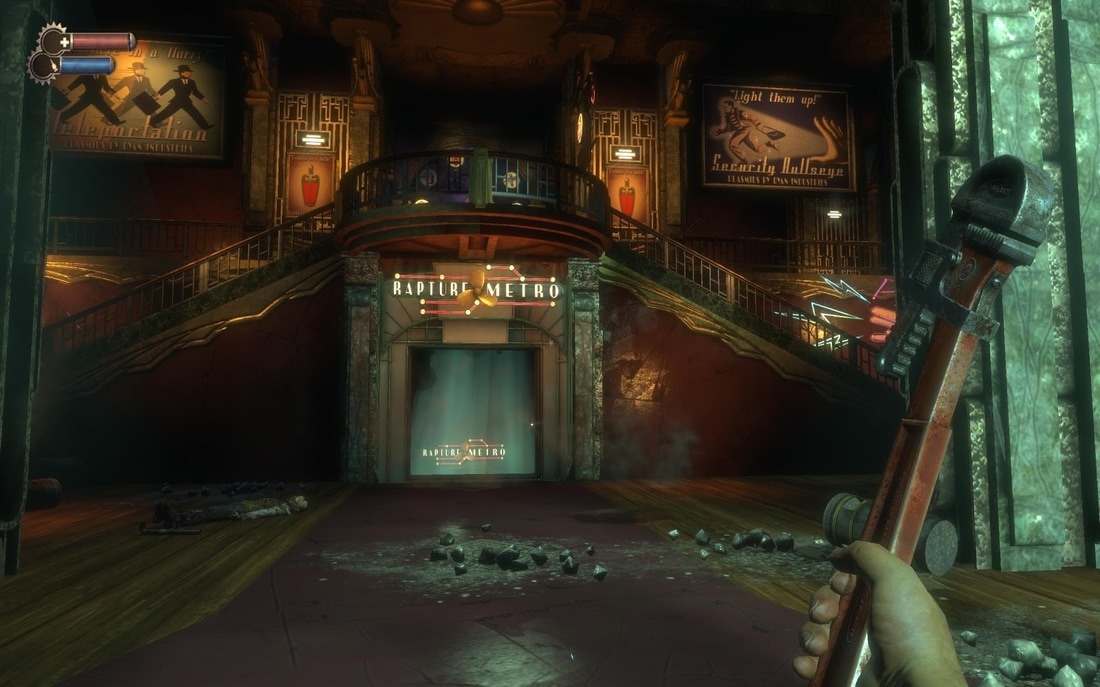 Fire is used as a redirecting tool to block off certain areas that the player may be lead down. This gives the illusion of endless hallways to discover but contextually, fire moves you away from these areas and leads you through a very linear route. 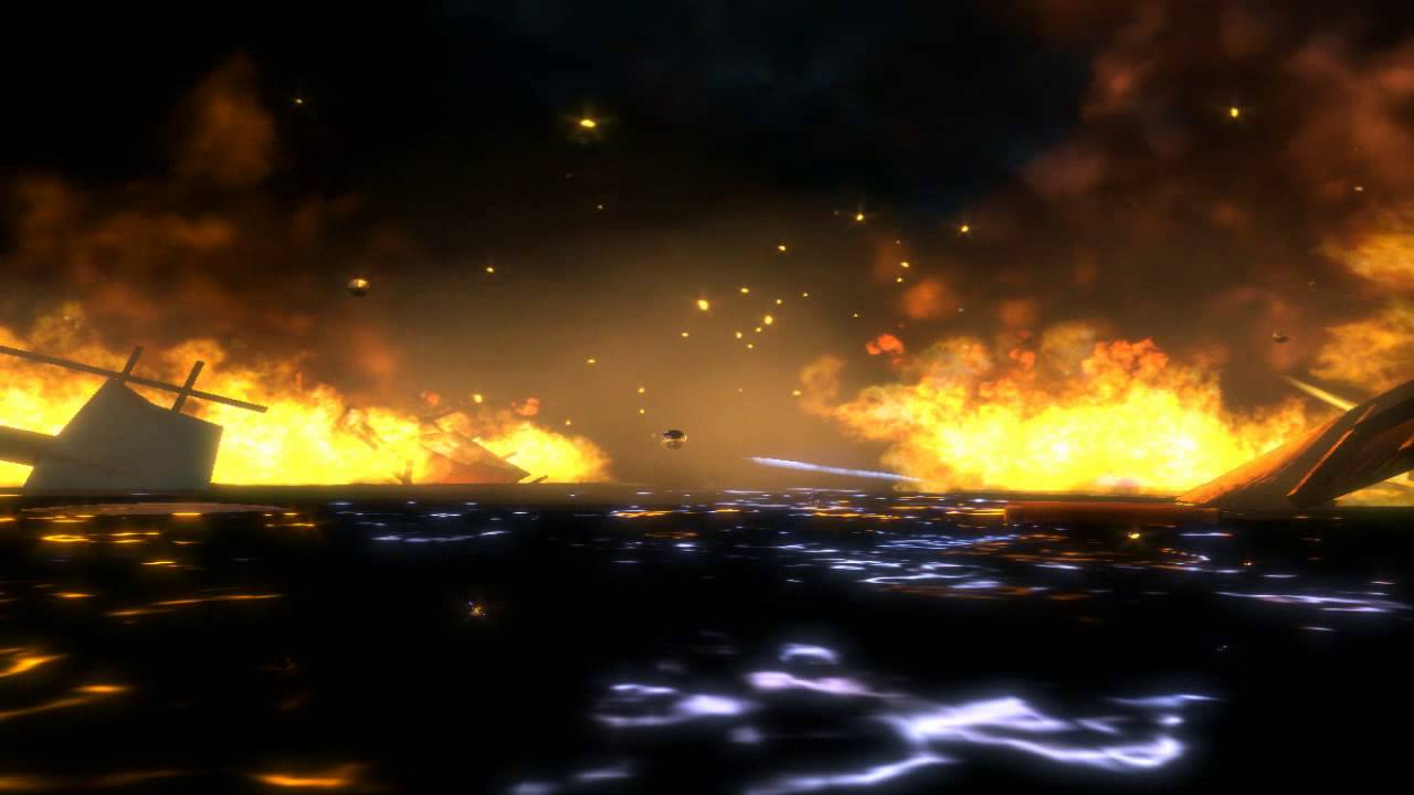 Enemies are an interesting part of the game as there are encounters, where they give you a wall where you are able to see the shadows of a menacing character to make them seem bigger and scarier than they actually are. Also some breadcrumbs around the environment where there could be an ambush, is that there is water/puddles where you are able to use your lightning plasmid ability to shock multiple enemies.
|
World design theory (WDT)DevelopersThe goal of this blog is to relate current and past attempts at world design to further improve our understanding. Archives
October 2017
Categories |
 RSS Feed
